Honouring the craft of the copper
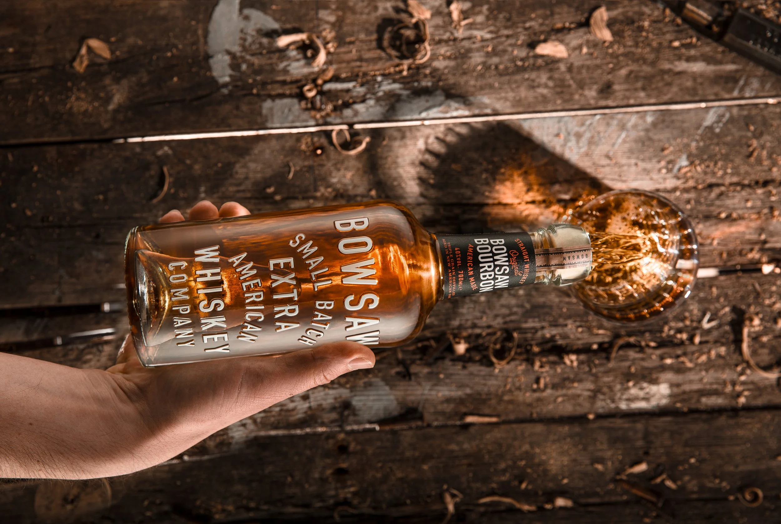
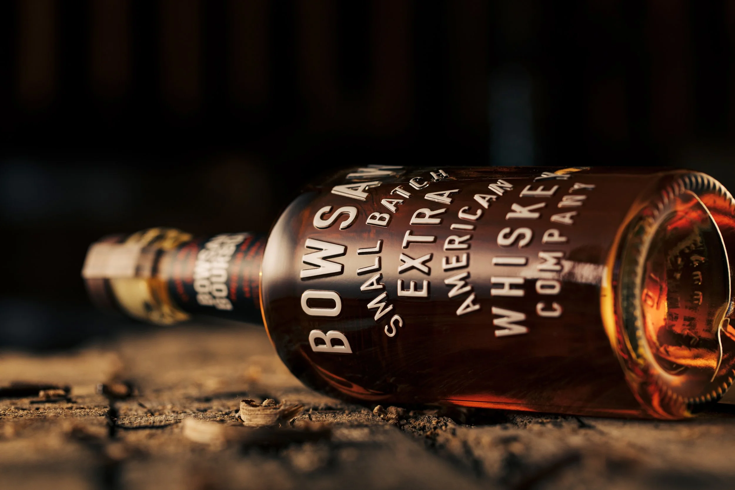
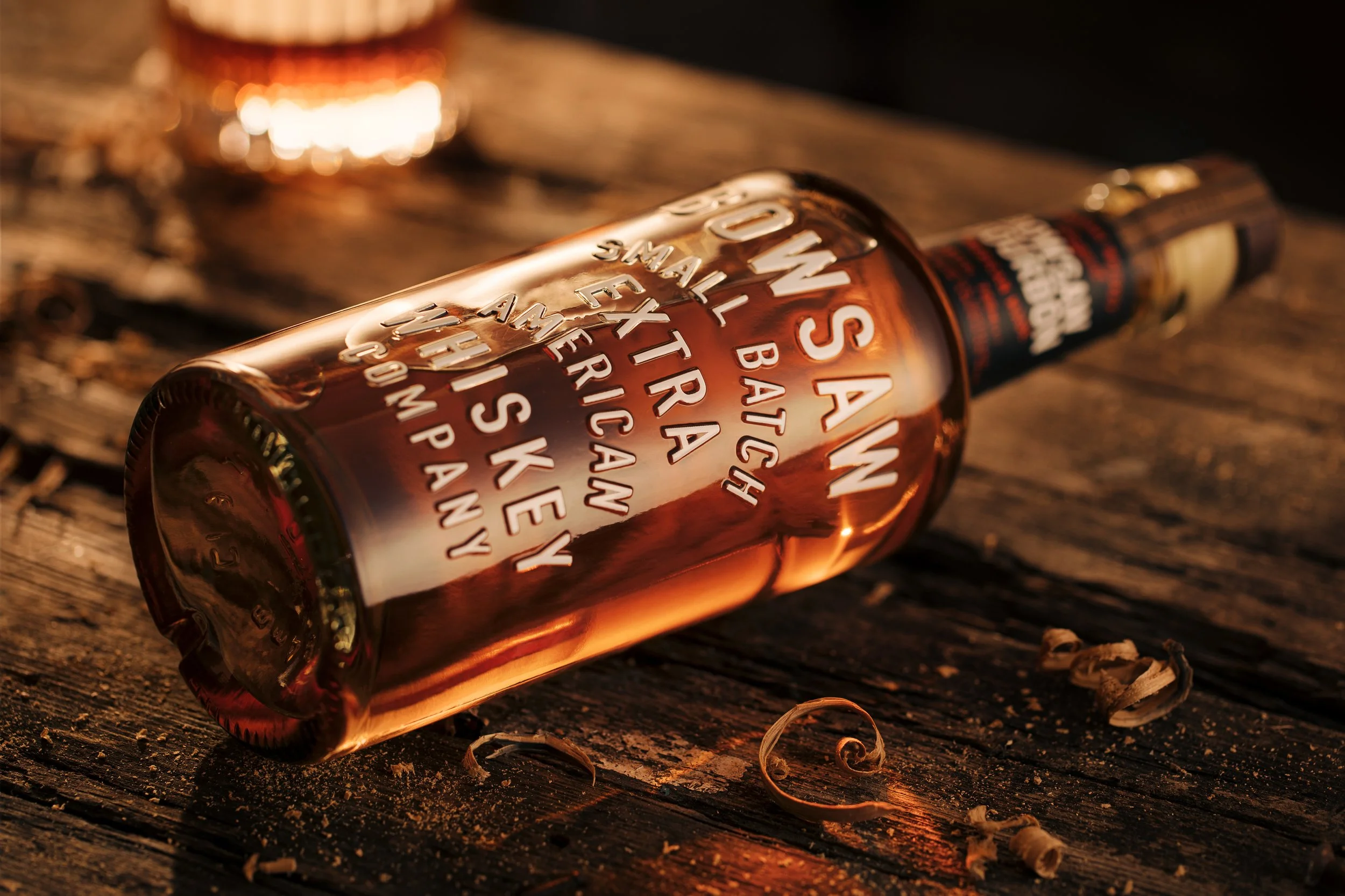
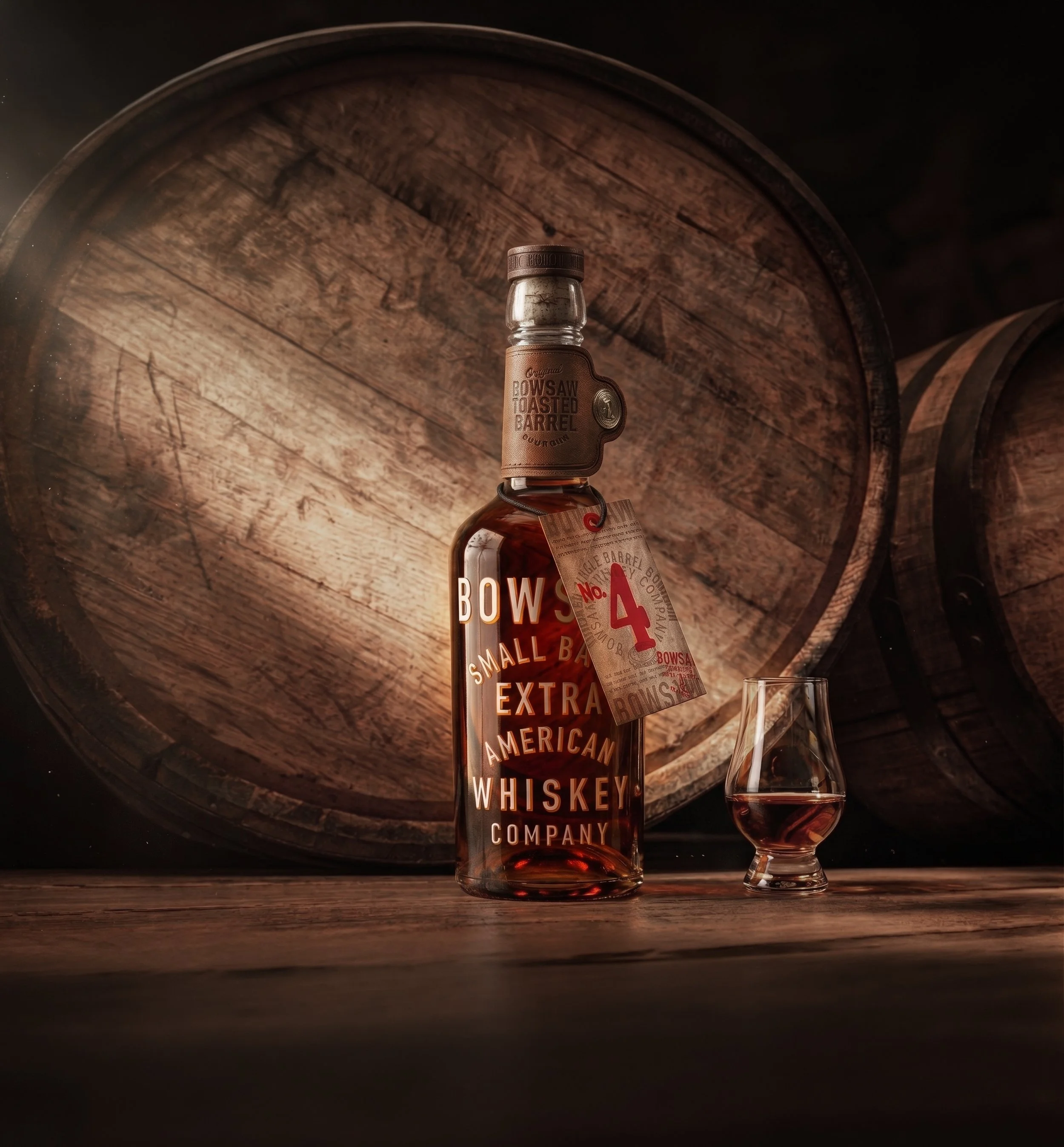
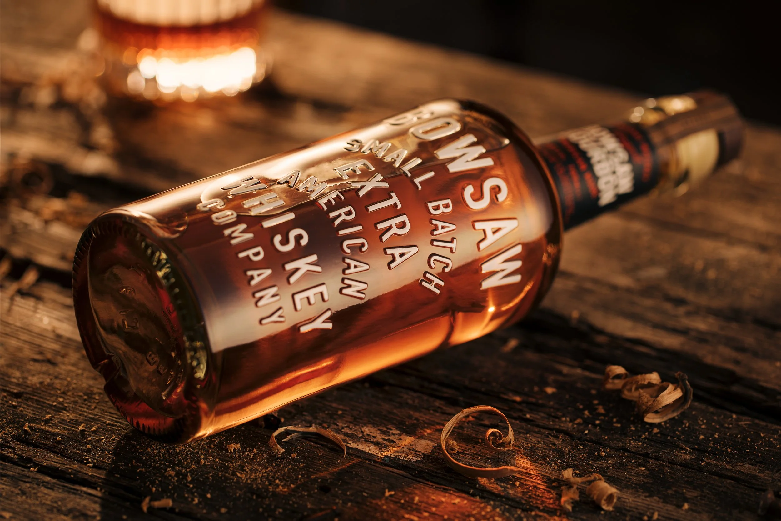
Named after the essential tool used to cut the heads of the barrels, grounding the identity in the tactile, rugged world of traditional whiskey production. To complement this name, we mastered the challenging technique of screen printing onto intricate, ornate embossing. The result is a truly distinctive design that pays homage to a bygone era of American whiskey production - and by opting for recycled glass, the bottle feels as though it was pulled directly from a pre-prohibition rickhouse.
Naming
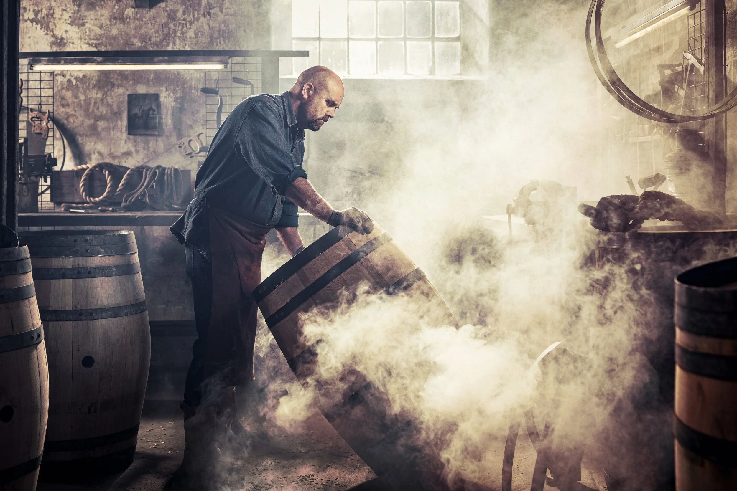
It’s no mean feat in todays world to secure trademark availability of a name so intrinsically linked to the whiskey production process.
Brand Positioning
Being one of our own Kirker Greer portfolio brands, we manage all aspects of positioning and activation across consumer and trade marketing.
Product Design
A world’s first that automated screen-printing onto an intricate text emboss to give a truly ownable aesthetic that stands out on shelf.
Commercial intelligence
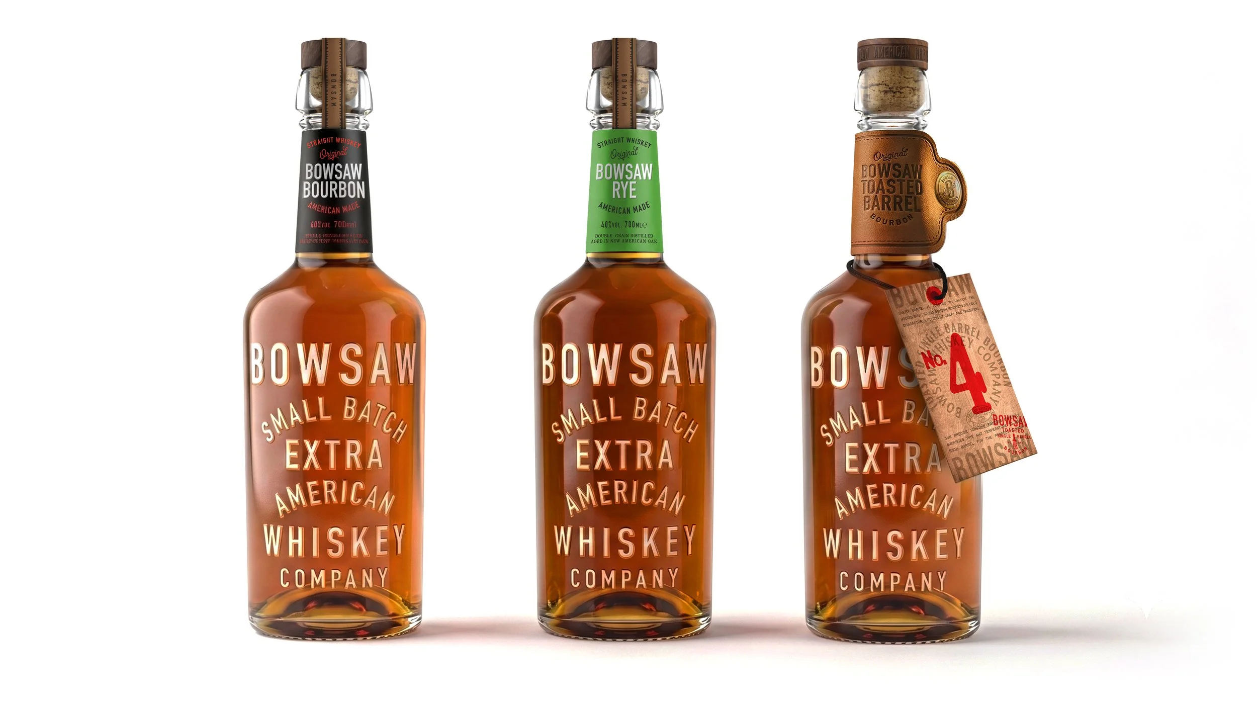
In line with our studio’s focus on commercial intelligence, the bottle’s architecture is designed for maximum efficiency and impact. We implemented a domed punt (or push) in the base, which allows the outer silhouette to remain consistent across multiple volume sizes. This intelligent engineering enables a “cascade of efficiency,” allowing the brand to minimise new mould costs, utilise the same shipper cases, value added packaging, and POS materials across territories. The two core variants are identified through neck labelling, ensuring the intricate, screen-printed body of the bottle remains the hero of the shelf.