Roe&Co brand positioning and label development
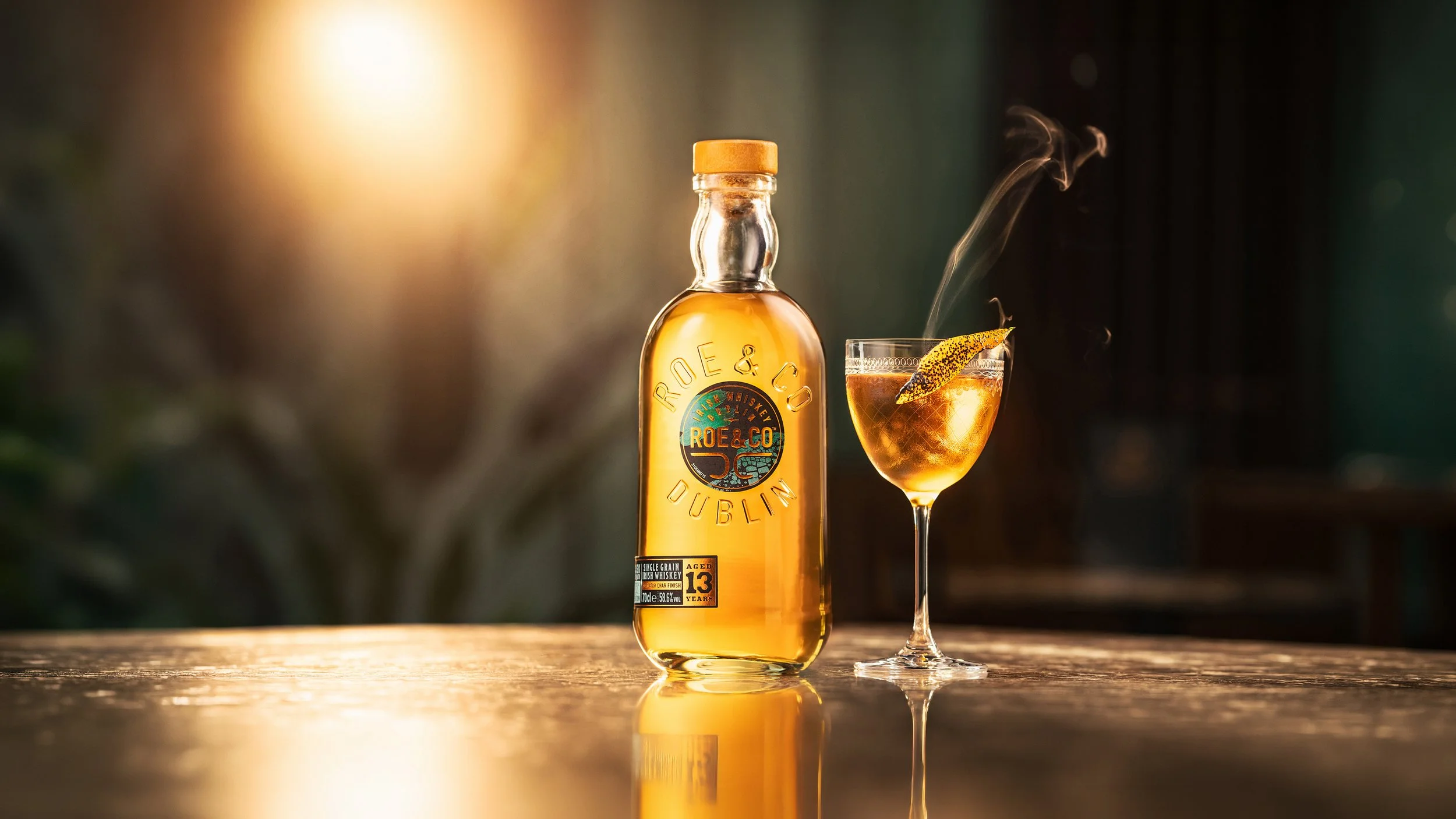
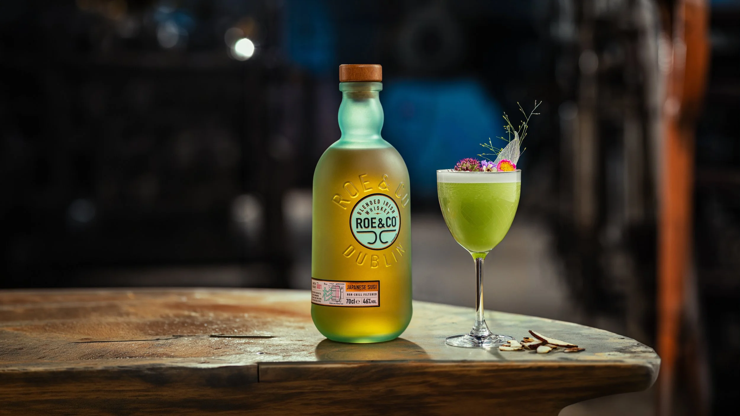
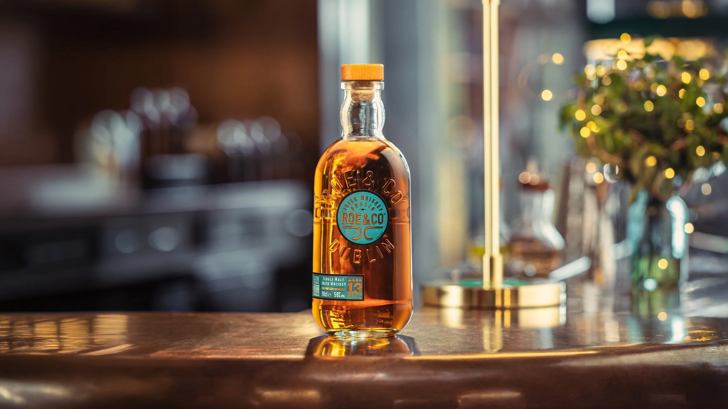
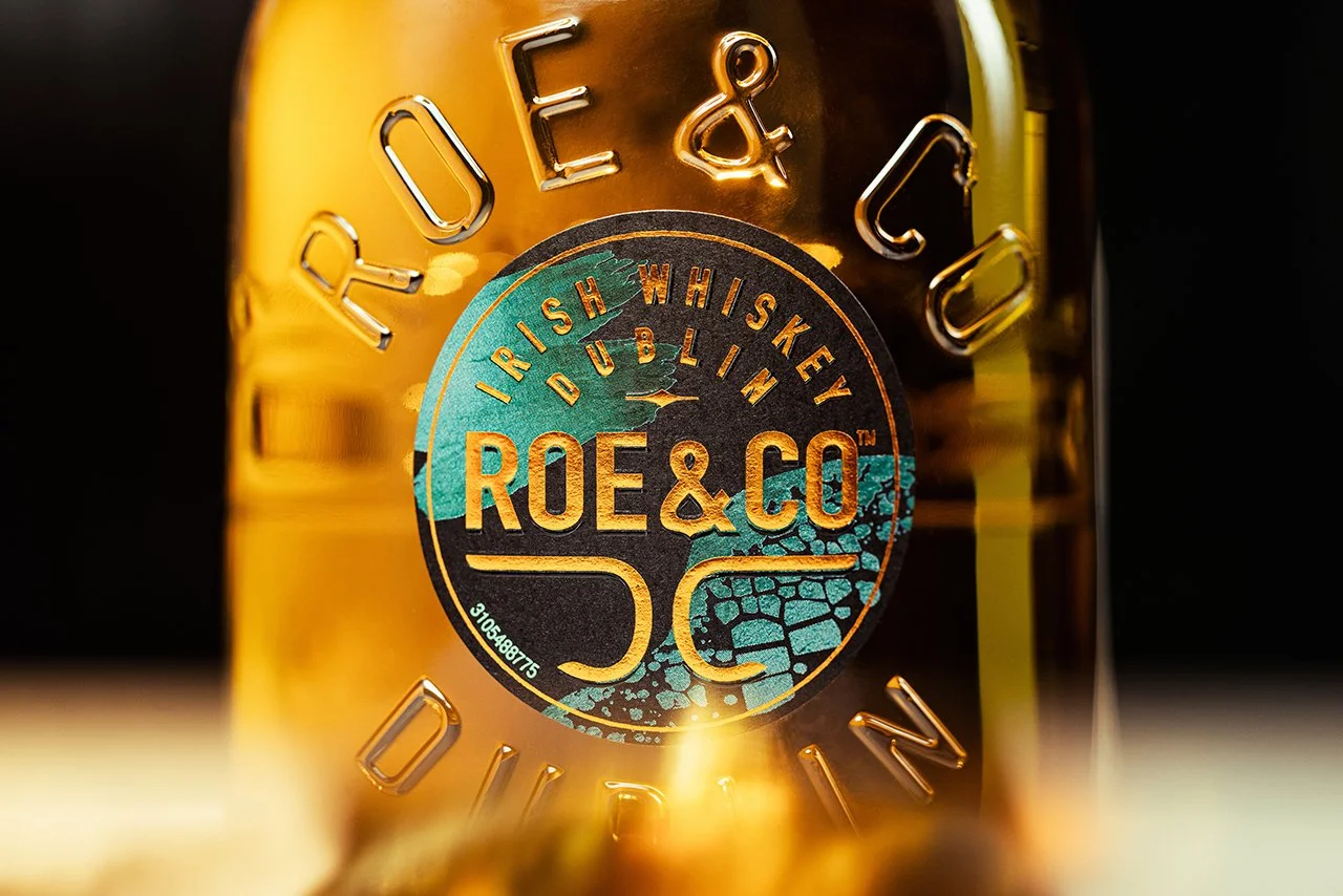
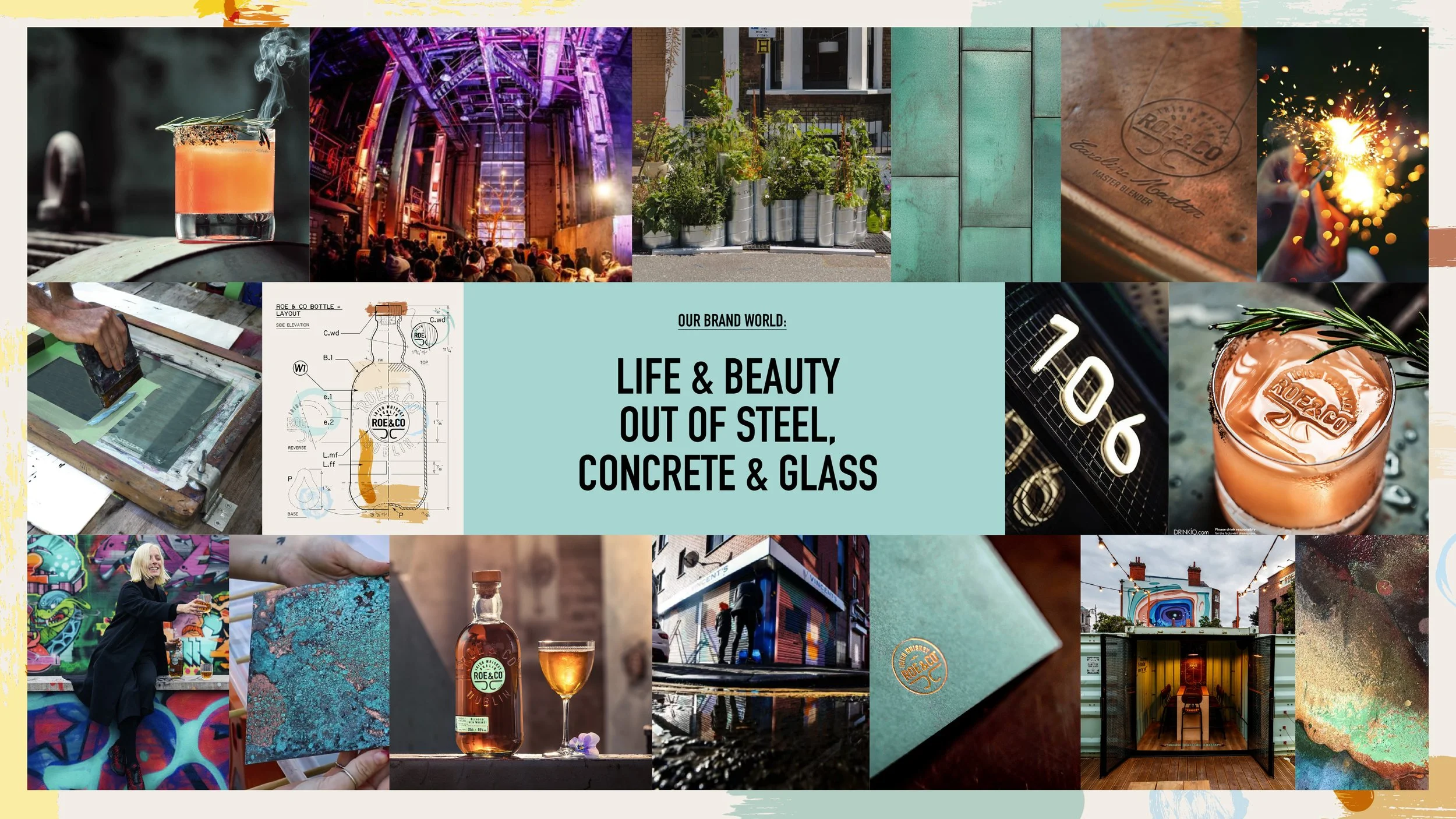
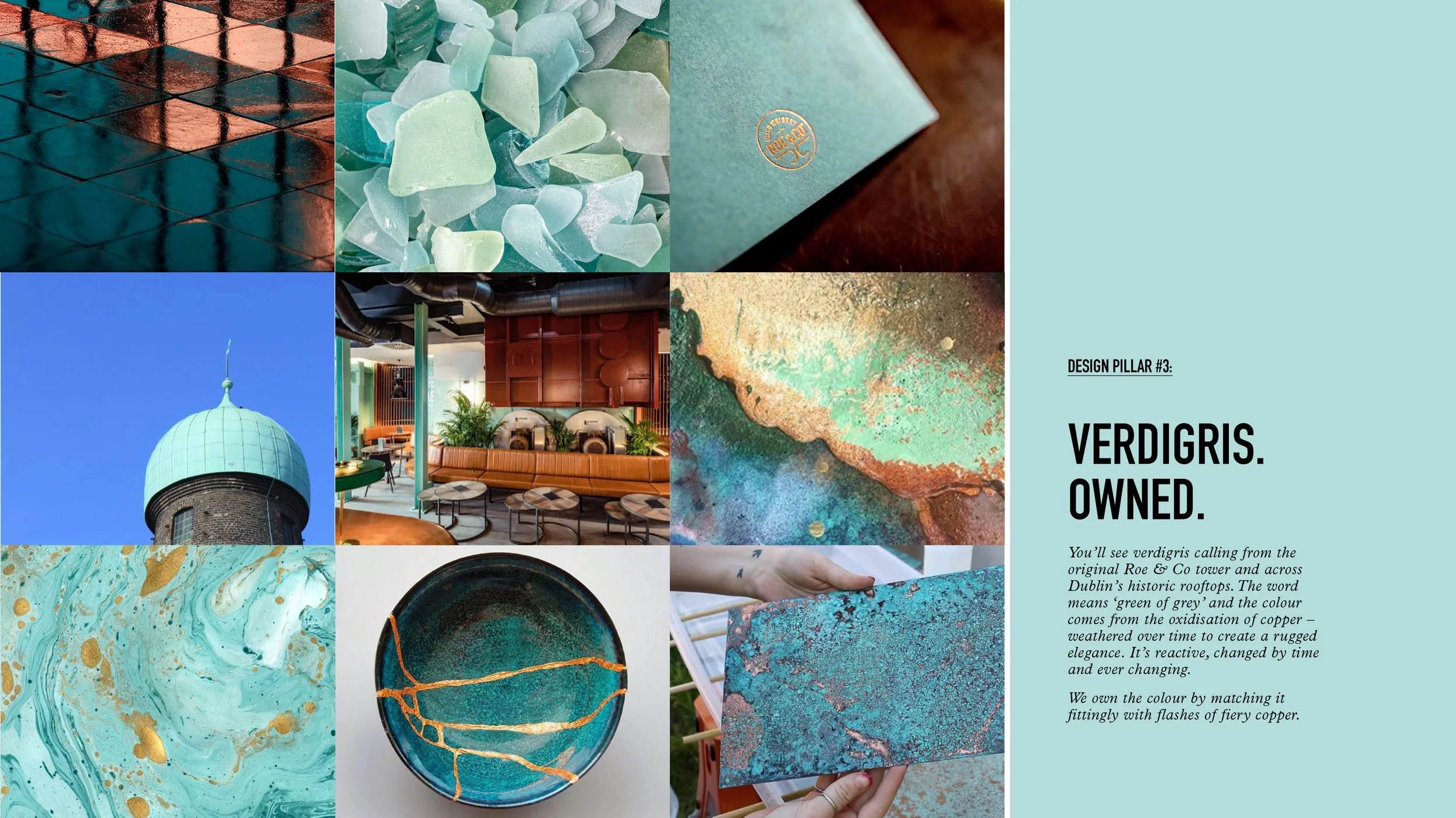
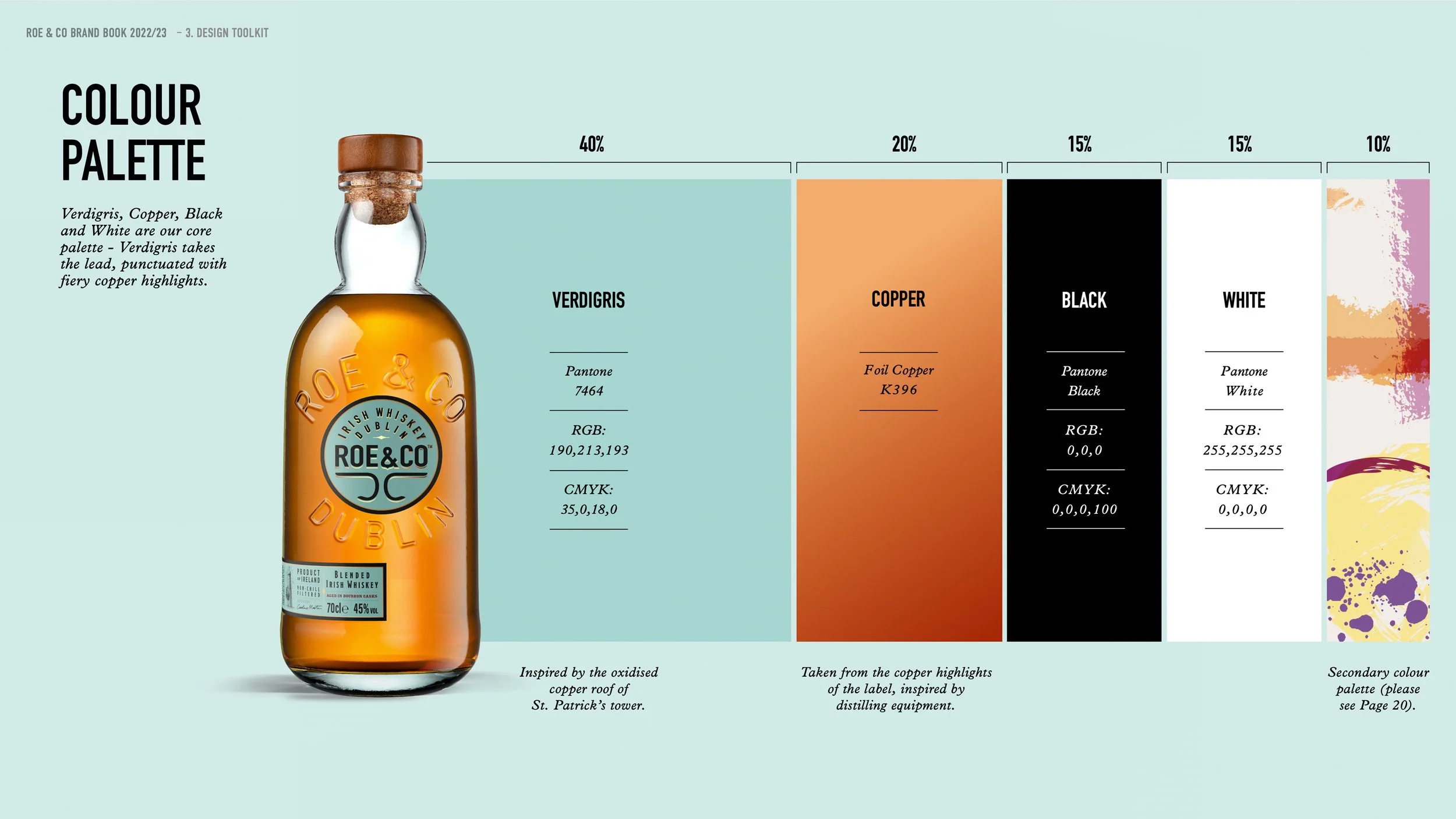
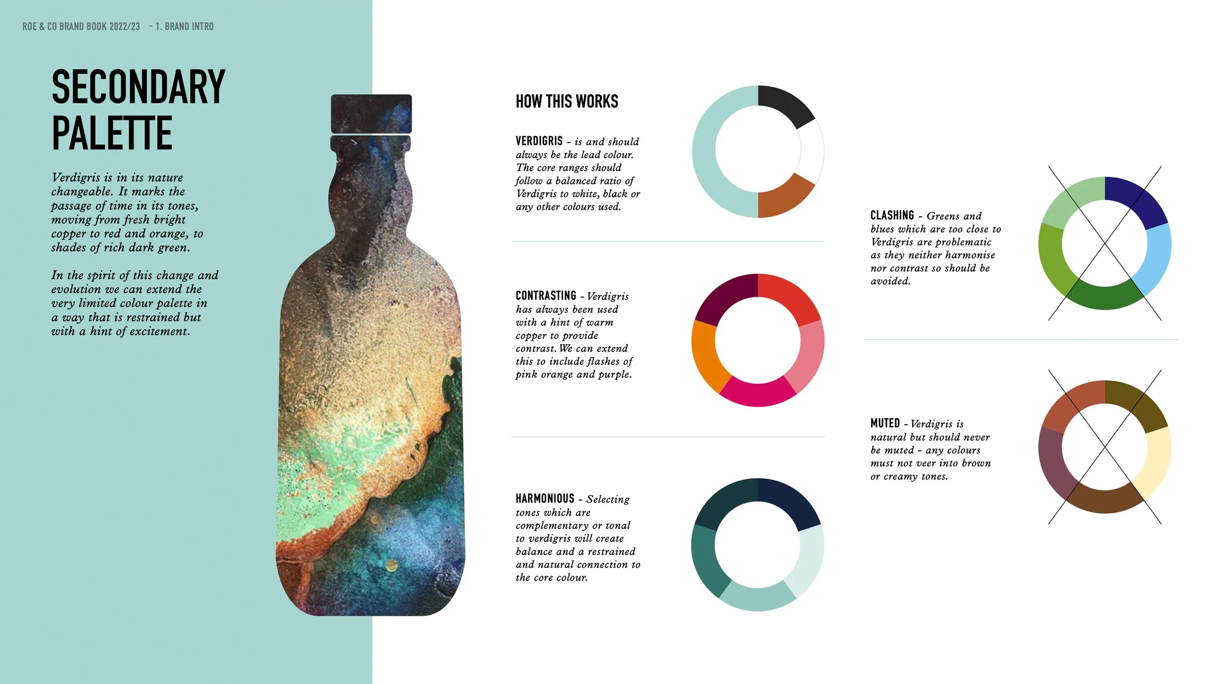
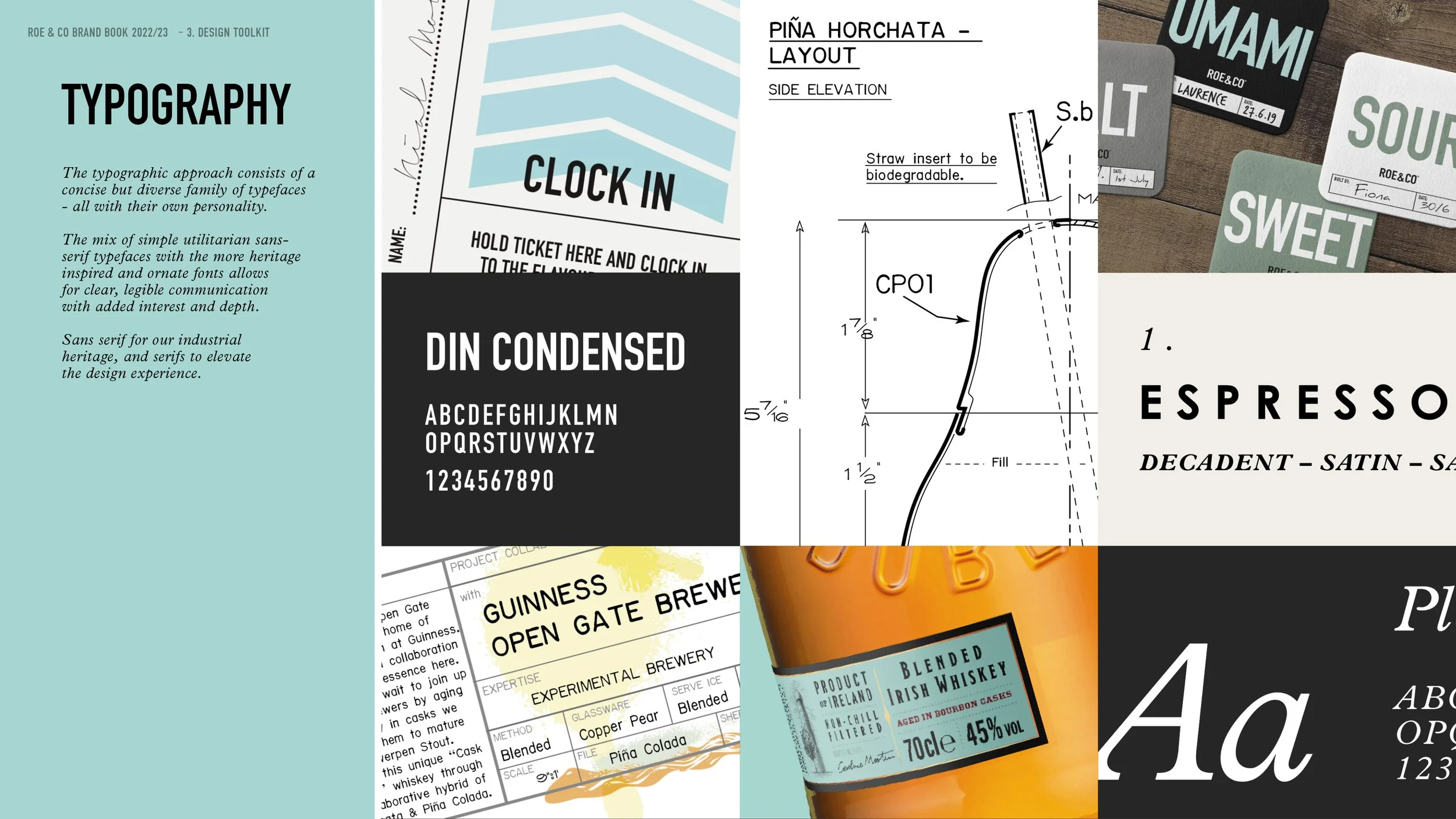
We proudly drive the ongoing development of Diageo’s Roe&Co Irish Whiskey positioning and label designs. Much like our design of the Distillery in Guinness’s derelict power station, the positioning is a testament to the belief that transformation is a constant within the whiskey world. Central to this visual identity is the strategic ownership of the colour verdigris. Just as bright copper naturally weathers into a rich verdigris patina, our design philosophy embraces the depth, texture, and character that time provides. With a wealth of unique expressions, each requires a bold, imaginative and memorable design approach within the confines of limited label real-estate.
Brand Architecture
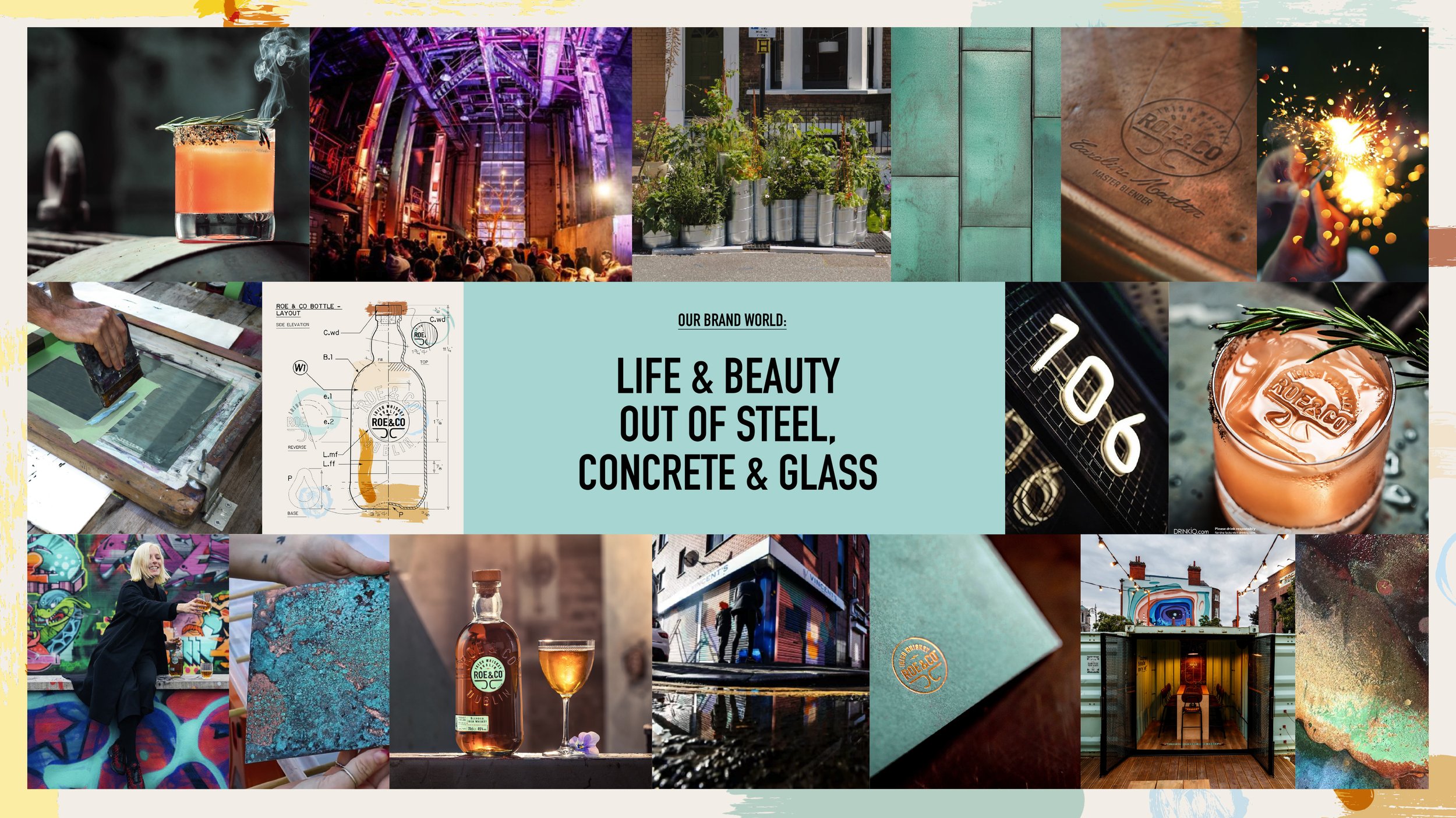
Exceptional brands are built on robust design and compelling positioning. We established these strategic foundations in tandem with crafting the overarching design brand bible and the physical distillery space.
Label Development
By aligning line extensions with core brand architecture, we’ve created a growing range of distinctive, ownable product designs that perfectly reflect Roe & Co’s inherently playful nature.
Built on strong foundations
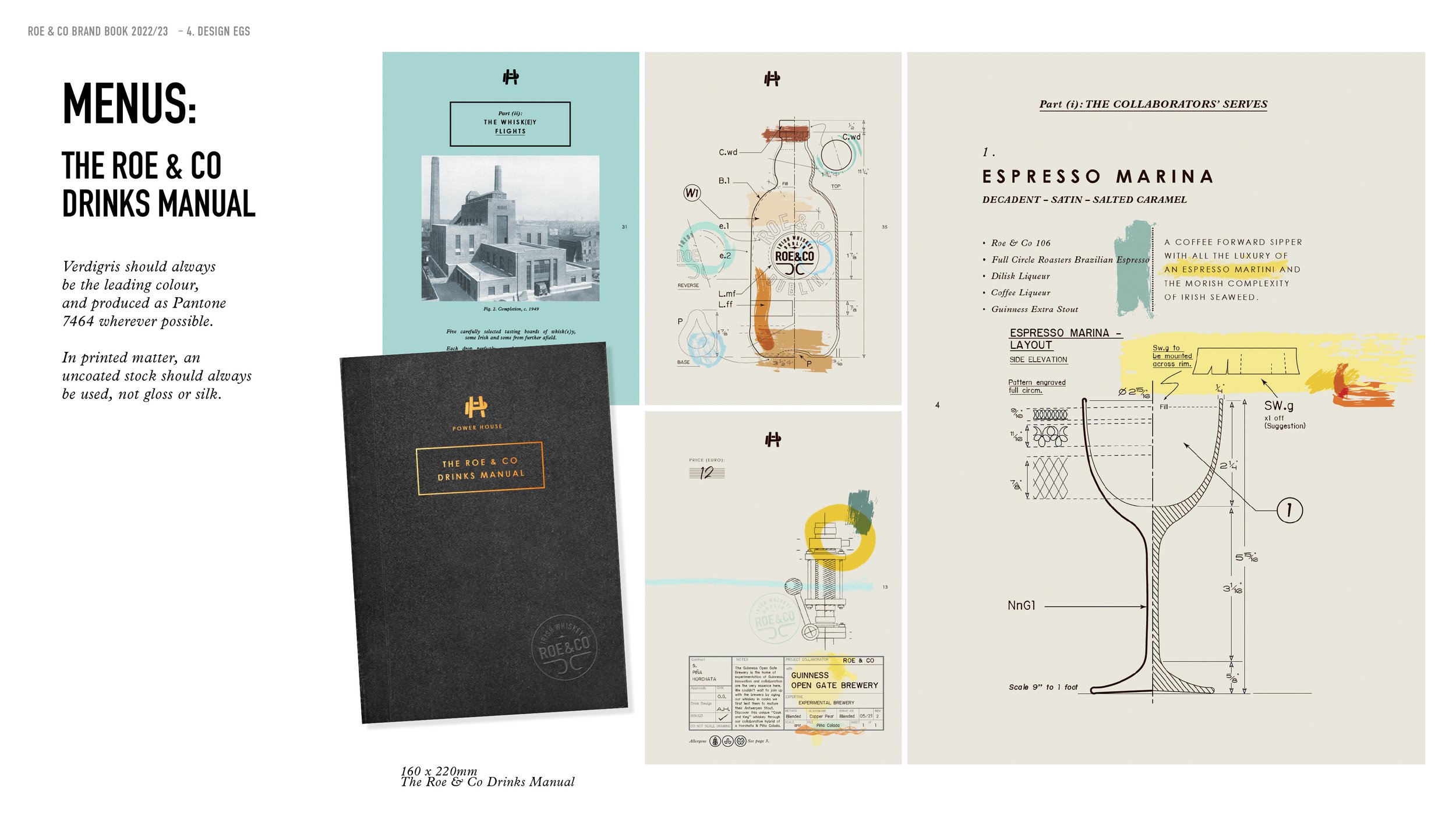
As with most of the brands we design we also take on responsibility for the core brand architecture and brand guidelines. In the case of Roe&Co this led to an expansive brand world positioning project that locked-in the visual foundations from the beginning. This thinking has manifested through all aspects of the brand journey including our design of the distillery, ongoing label development and the production of POS items including the highly coveted Roe&Co distillery menus.
On pack label (r)evolution
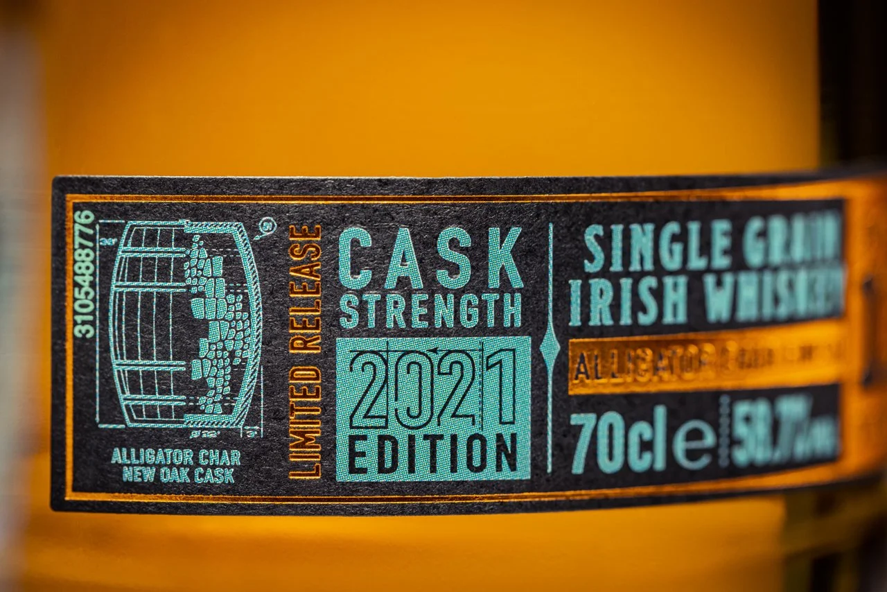
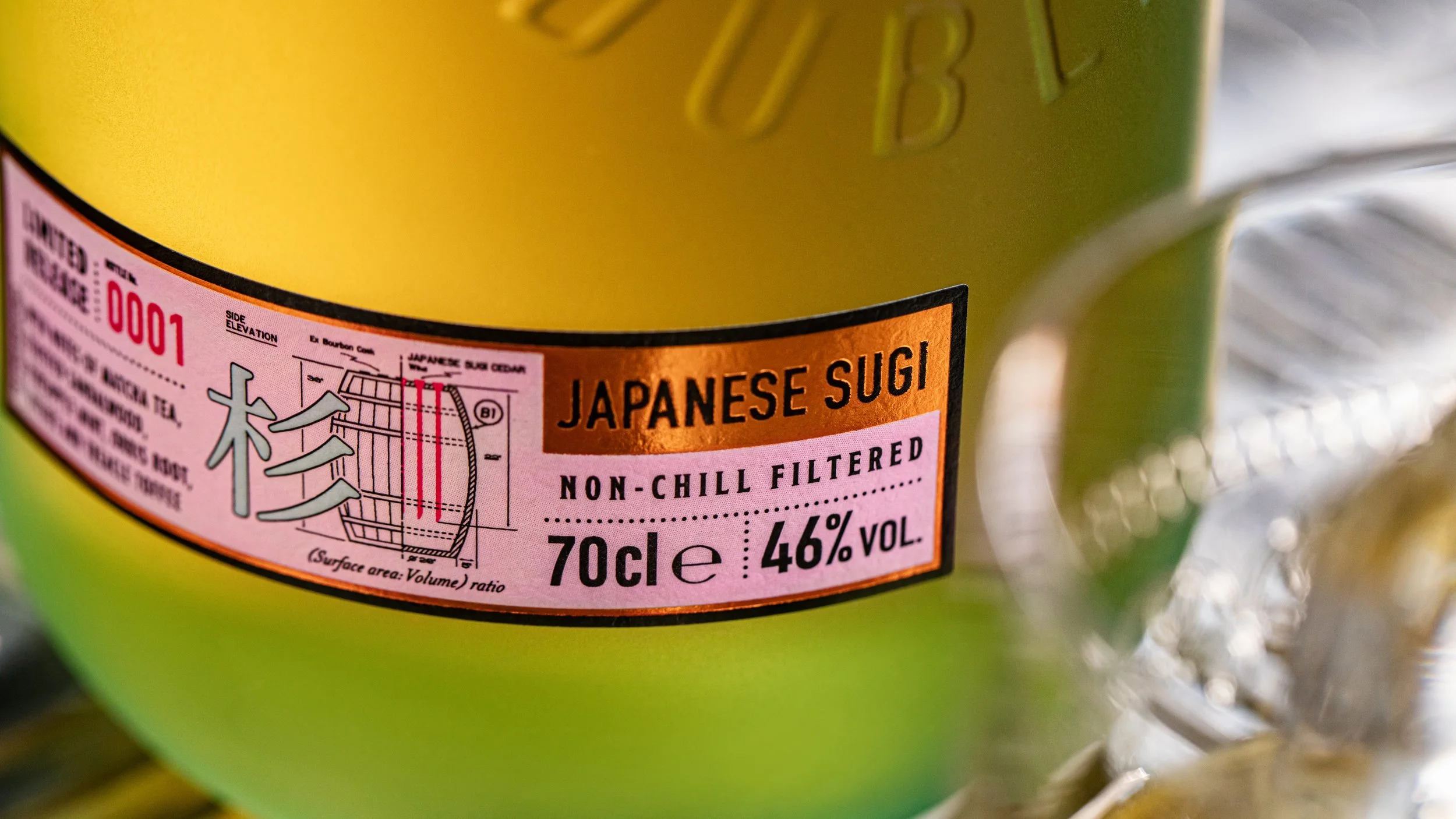
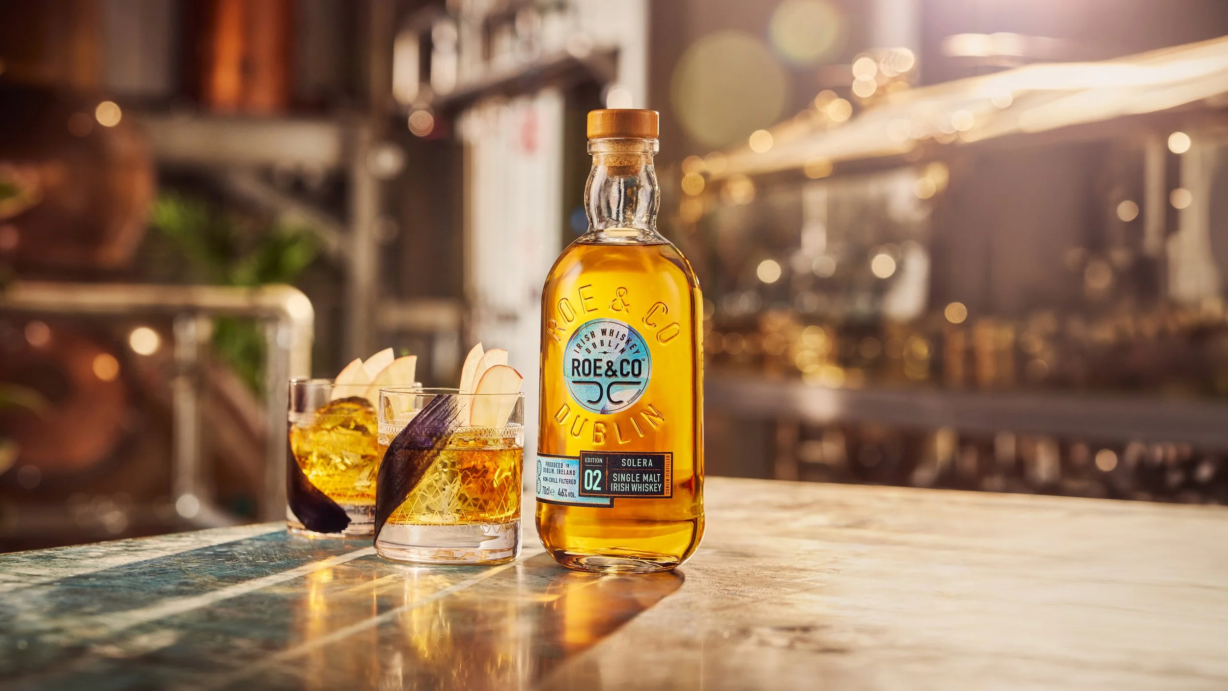
The brand architecture philosophy is physically manifested in how we apply evolving pack narratives to the existing bottle silhouette. The glass remains the permanent anchor, while the labels provide the canvas for textural exploration. The Alligator Char Cask expression for example is a tactile homage to the spirit’s origin, featuring a label texture that mimics the scales of an alligator to represent the intense charring of the wood. In contrast, the Solera Cask expression utilises iridescent colours that shimmer in the light, creating a dynamic play of light that mirrors the complex fractional blending of the liquid. These vibrant finishes are set against soft, high-quality textural paper stocks, creating a sensory experience that is both sophisticated and engaging. By balancing these high-concept finishes against the permanent silhouette, we ensure Roe&Co achieves a consistency that is always recognisable yet perpetually fresh.